SMT Equipment Trade Oü,
freelance website project in 2022
SMT Equipment Trade Oü,
freelance website project in 2022

Overview
Overview
SMT Equipment Trade Oü is an SMT production machine trading company that sells new and used production machinery. They had a need for a new website with a specific layout in mind.
I designed the website around an existing WordPress theme that provided the needed layout which I modified by applying custom CSS code.
Client
SMT Equipment Trade Oü
Client
SMT Equipment Trade Oü
Client
SMT Equipment Trade Oü
My role
UX/UI Designer & Developer
My role
UX/UI Designer, Developer
My role
UX/UI Designer & Developer
Tools
Figma
WordPress
Tools
Figma
WordPress
Tools
Figma
WordPress
The challenge
The challenge
The customer had a need for a website in order to facilitate an online presence and a platform for selling the company’s products. Client had a need for subpages for showcasing partner companies and used equipment.
The customer had a need for a website in order to facilitate an online presence and a platform for selling the company’s products. Client had a need for subpages for showcasing partner companies and used equipment.
Process
The customer had a specific layout and content in mind so the process was quite straightforward. WordPress was chosen as the platform as the customer had benchmarked a website that used a free WordPress theme. The same theme was then used as a starting point for developing a solution that is both usable and easy to update.
The customer had a specific layout and content in mind so the process was quite straightforward. WordPress was chosen as the platform as the customer had benchmarked a website that used a free WordPress theme. The same theme was then used as a starting point for developing a solution that is both usable and easy to update.
Research
Research
The client had a clear vision for the project so mainly a competitor analysis and some additional benchmarking was provided by me at this stage in order to understand how the machines are usually showcased and how other companies use their websites to do so.
The client had a clear vision for the project so mainly a competitor analysis and some additional benchmarking was provided by me at this stage in order to understand how the machines are usually showcased and how other companies use their websites to do so.
Visual system
Visual system
The client did not yet have a consistent brand identity online so there was a need for logos, a color scheme and typography options. A blue color was chosen as the accent color as it is connected to safety and reliability, two key values of the company. The primary logo has the company's name in written form.
The secondary logo depicts a simplified integrated circuit that is mainly seen in the favicon of the website but can be later on used in other instances. The chosen typography is clear and formal as it needs to reflect the technical nature of the industry. Regarding the colors, the website follows the 60-30-10 rule.


Final product
Final product
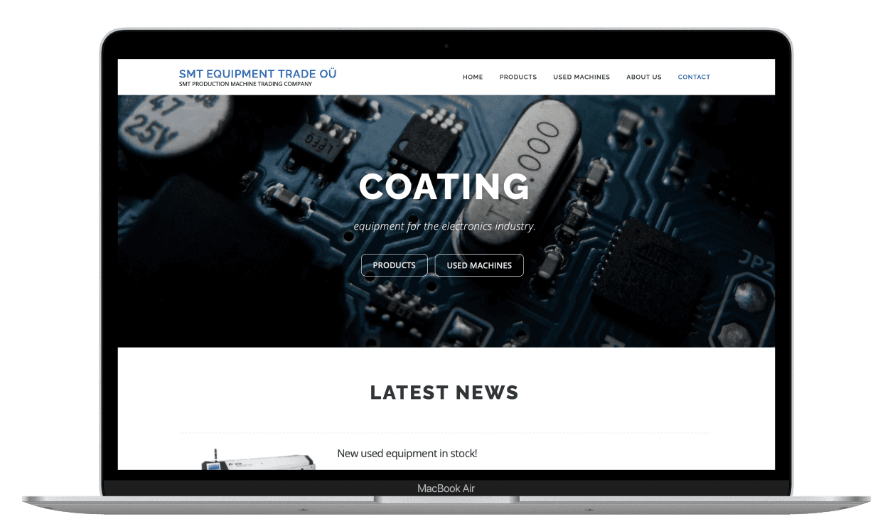
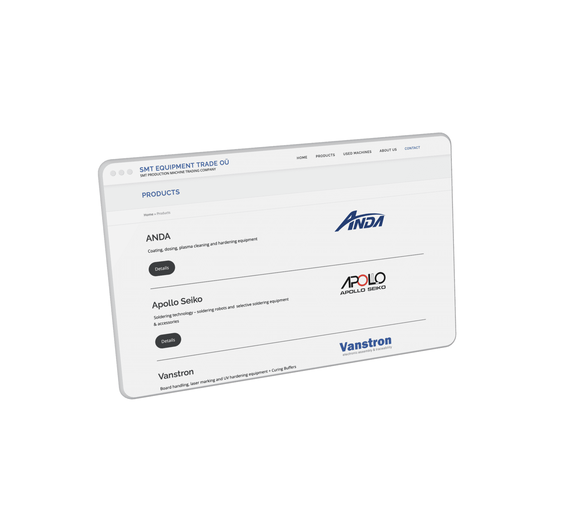
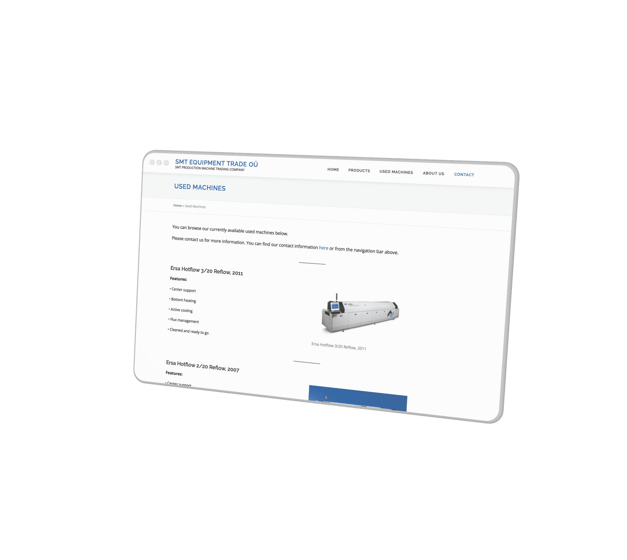
The customer was really pleased with the result as was I. The site has a clear information architecture, good use of negative space and good responsiveness. On the homepage a visitor can see what the company is about as well as the latest news the company has published. This is also a good way to improve search engine optimization. In addition to the product catalog, other pages show only the necessary information.
Later on, the used machines catalog will be updated, more information is going to be added to the website and the "Products" page will be slightly redesigned.


Takeaways
Takeaways
During this project I learned a lot about WordPress and this was my first time working with a client. It was really rewarding to be able to influence on the visual identity of a company. This project is ongoing and I will be maintaining and updating the website according to the client's needs.
During this project I learned a lot about WordPress and this was my first time working with a client. It was really rewarding to be able to influence on the visual identity of a company. This project is ongoing and I will be maintaining and updating the website according to the client's needs.