Metropolia UAS,
website redesign in 2022

Metropolia UAS,
website redesign in 2022

Metropolia UAS, website redesign in 2022

Overview

Overview

During my studies for a Bachelor’s Degree in Design I participated in an assignment where our goal was to redesign an existing website for new applicants to our degree program. In addition, we updated and managed the social media accounts of the program.


You can check out the site from the link below, note that a new class of students redesign the website every fall, so the link takes you to their redesign.

Client


Metropolia UAS,

Degree Programme in Design

Client


Metropolia UAS,

Degree Programme in Design

Client


Metropolia UAS,

Degree Programme in Design

My role


UX/UI Designer & Developer

My role


UX/UI Designer, Developer

My role


UX/UI Designer & Developer

Tools


Figma

VS Code

Google Forms

Jira

Adobe Illustrator

Tools


Figma

VS Code

Google Forms

Jira

Adobe Ilustrator

Tools


Figma

VS Code

Google Forms

Jira

Illustrator

The challenge

The challenge

New applicants need to go through multiple websites in order to find all the necessary information that they need for applying to the degree program. Our challenge was to redesign the website so that all the necessary information is in one place in a way that also inspires new applicants to apply to the degree programme.

New applicants need to go through multiple websites in order to find all the necessary information that they need for applying to the degree program. Our challenge was to redesign the website so that all the necessary information is in one place in a way that also inspires new applicants to apply to the degree programme.

The process

The design process followed a slightly modified Double Diamond framework. Our work was organised by using a kanban board. Figma was used for ideation, wireframing and prototyping.
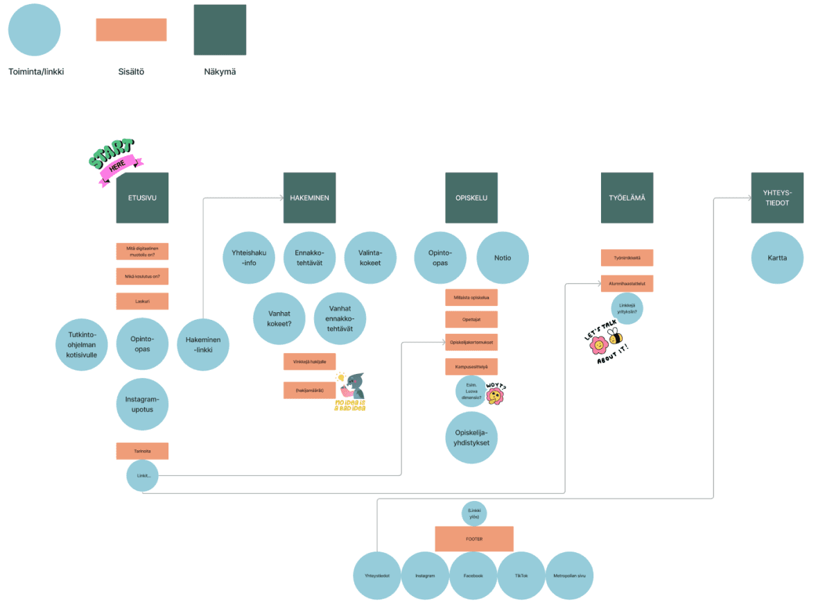
Information architecture

Research

User research was conducted through surveys, interviews and comprehensive benchmarking. I addition, user personas, user journeys and an information architecture were laid out.

As a part of our research we benchmarked several applicant websites and other websites in the field of design. This was done in order to notice current trends in web design.
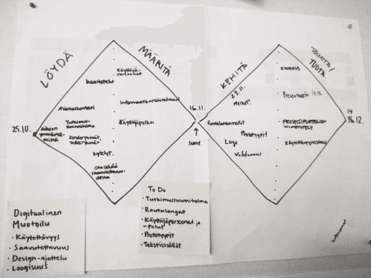
The Double Diamond workframe

Interviews

Interviews were conducted with visitors from a vocational school who are potential applicants to the program. This allowed us to understand what kind of information they are looking for and how they search information about potential degree programs.

In addition, we interviewed students from each year and some alumni for content displayed on the website.

Computer with a survey on the screen

Survey

A survey was conducted through Google Forms and was directed to students who had applied to the program in the previous year.
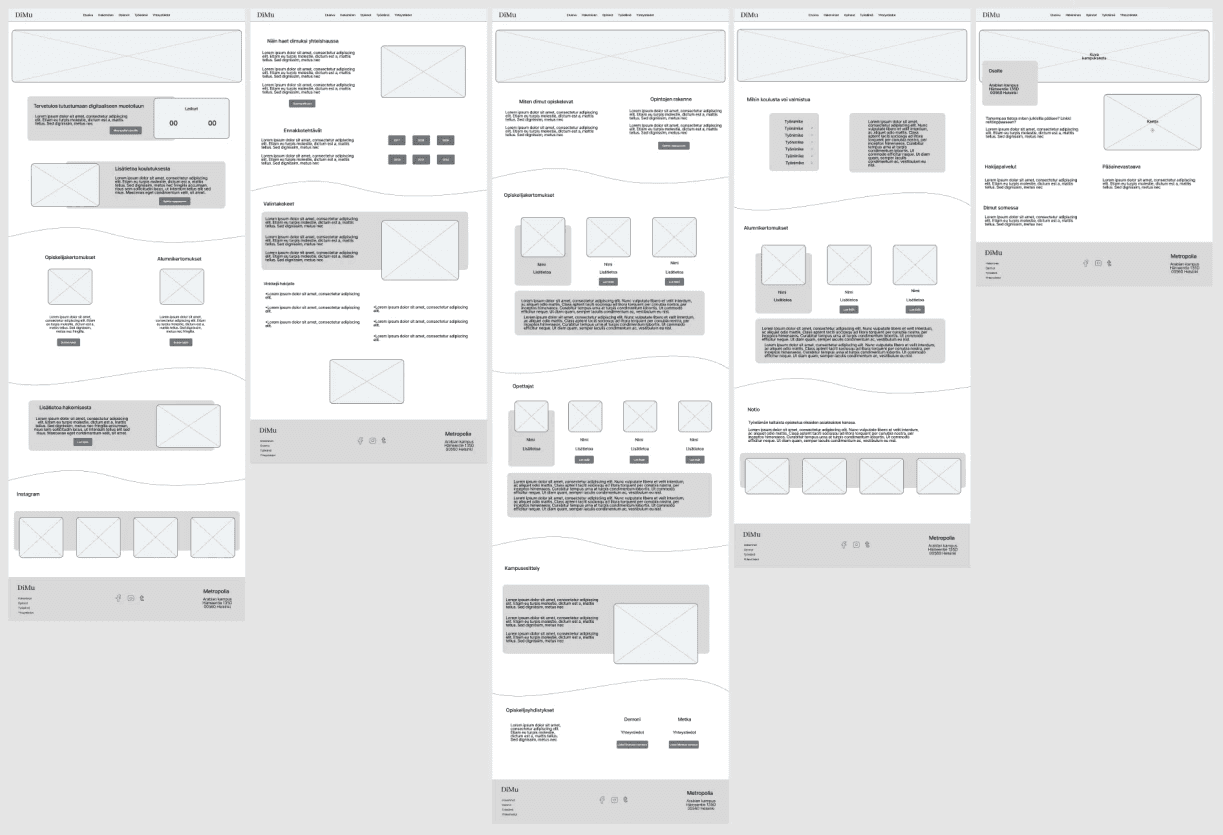
Digital wireframes

Wireframing & prototypes

From the research phase we moved onto creating wireframes from all of the needed screens. After our client had approved them we created a prototype with finalized visual designs.

Written code syntax on a computer screen

Writing the code

After the prototype had received approval we started to write the code utilising Visual Studio Code and GitHub. First we wrote the HTML and CSS and then added functionalities with Javascript.

Javascript was used in the navigation bar, a day counter and an accordion.
Key insights

Key insights

The survey helped us to understand how the website has been used during the application process and what students felt missing from the site.

We came to the conclusion that the website should have information about things like the application process, old entrance examinations, general information about studying in the program and interviews from the alumni.


Through benchmarking we ended up on a fresh and an appealing color palette and a design with accessible and informative content.

Final product

Final product

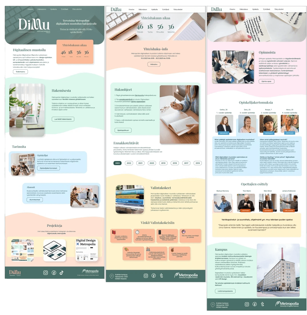
In the redesign we wanted to keep the colors fresh and light as according to our benchmarking and client’s wishes. The current trends include rounded corners, wisely applied negative space and some broken lines. Selected typefaces were chosen according to best practices so that they remain readable and there are only one Sans-Serif and one Serif typeface.


The redesign aims to provide good usability but also good accessibility. The contrasts on the page fill the WCAG AAA-classification. Typography is clear and of appropriate size. Too long paragraphs have been avoided with clear organization in the content.


Interactive elements have different states such as hover and focus and the links and buttons state their destinations. Elements are designed so that they are familiar to users. The code itself follows best practices and semantic syntax. In addition the website is optimized for mobile devices.

Mockups of the website

Takeaways

Takeaways

During this project I learned more about front-end development, working in a design team, project management with Jira’s software and communication with a client. Overall, this was a very educating and fun project that taught me a lot and prepared me for future endeavors in web design.

During this project I learned more about front-end development, working in a design team, project management with Jira’s software and communication with a client. Overall, this was a very educating and fun project that taught me a lot and prepared me for future endeavors in web design.

'' The best looking applicant site so far! ''


'' Gorgeous logo and the design looks trendy and fresh! ''

© 2024 John Parta | Designer | john.parta@outlook.com

Green Web Foundation badge

© 2024 John Parta | Designer | john.parta@outlook.com

Green Web Foundation badge

© 2024 John Parta | Designer | john.parta@outlook.com

Green Web Foundation badge