Soundwall
2022 | APP PROTOTYPE | UX/UI DESIGN
Soundwall
2022 | APP PROTOTYPE | UX/UI DESIGN
Overview
Overview
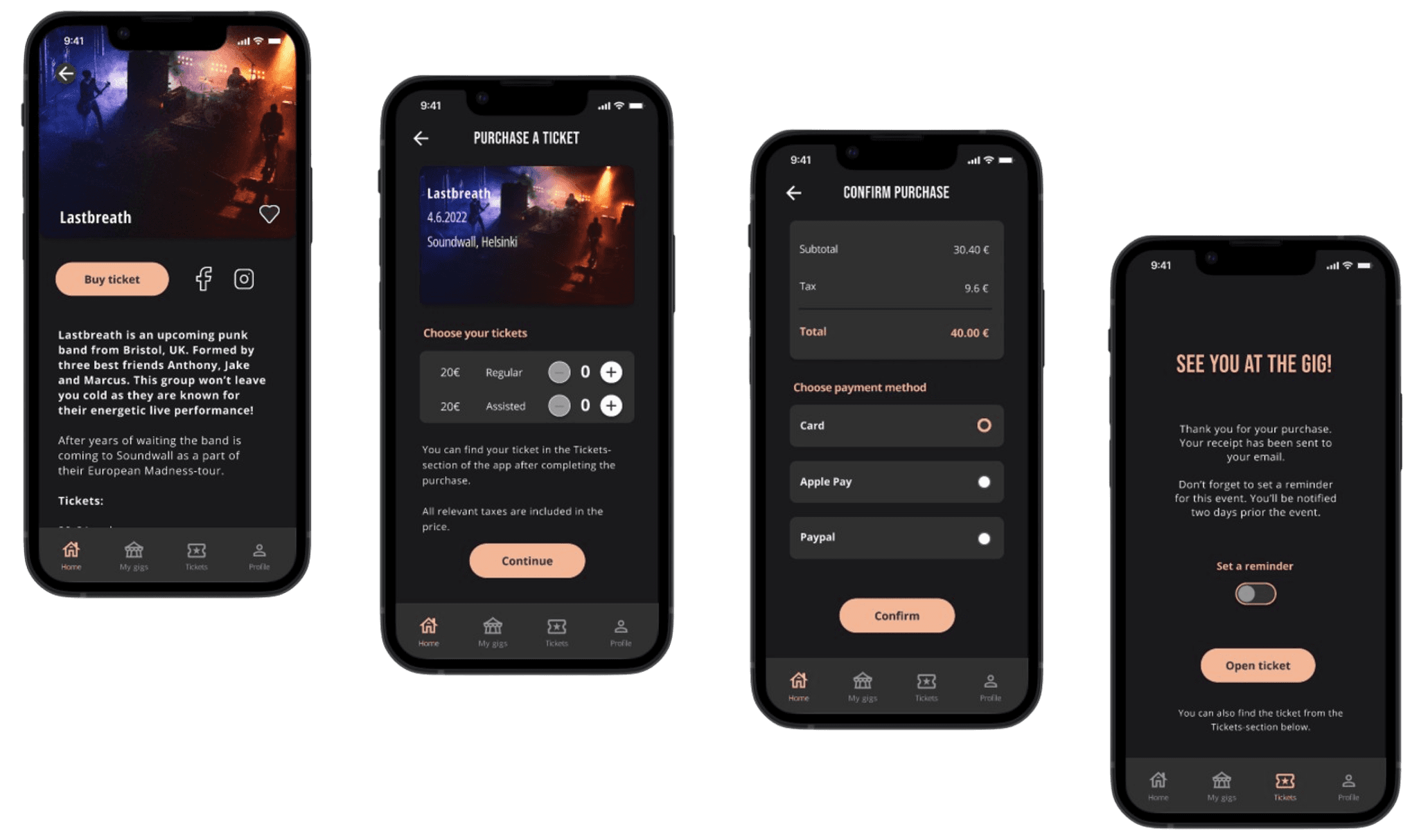
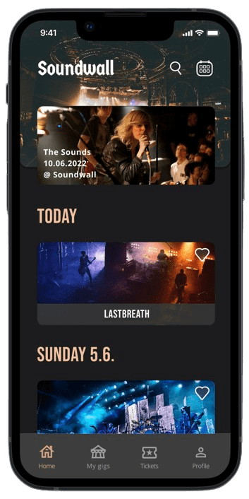
This concept application for a fictional music venue called Soundwall was produced during Google UX Design Professional Certificate course and it follows the Design Thinking process. The app is designed for iOS in Figma.
You can try the prototype below.
This concept application for a fictional music venue called Soundwall was produced during Google UX Design Professional Certificate course and it follows the Design Thinking process. The app is designed for iOS in Figma.
You can try the prototype by opening the link below:
Client
Personal course assignment
Client
Personal course
assignment
Client
Personal course assignment
My role
UX/UI Designer
My role
UX/UI Designer
Tools
Figma
Tools
Figma
The challenge
The challenge
In the beginning of the course each student was given a project. My task was to create an app for busy people who needed an effortless way to find, purchase and present concert tickets. My goal was to design an app that enables a smooth and safe concert experience for every visitor.
Process
A survey was conducted and based on it, an aggregated empathy map was used to better understand the users I was designing for.
My research also included an affinity map, flowcharts, a user journey map, storyboards, benchmarking and a competitor analysis. The competitor analysis and benchmarking showed me what other similar services are offering, how they have constructed their applications and what I could do better in my own work.
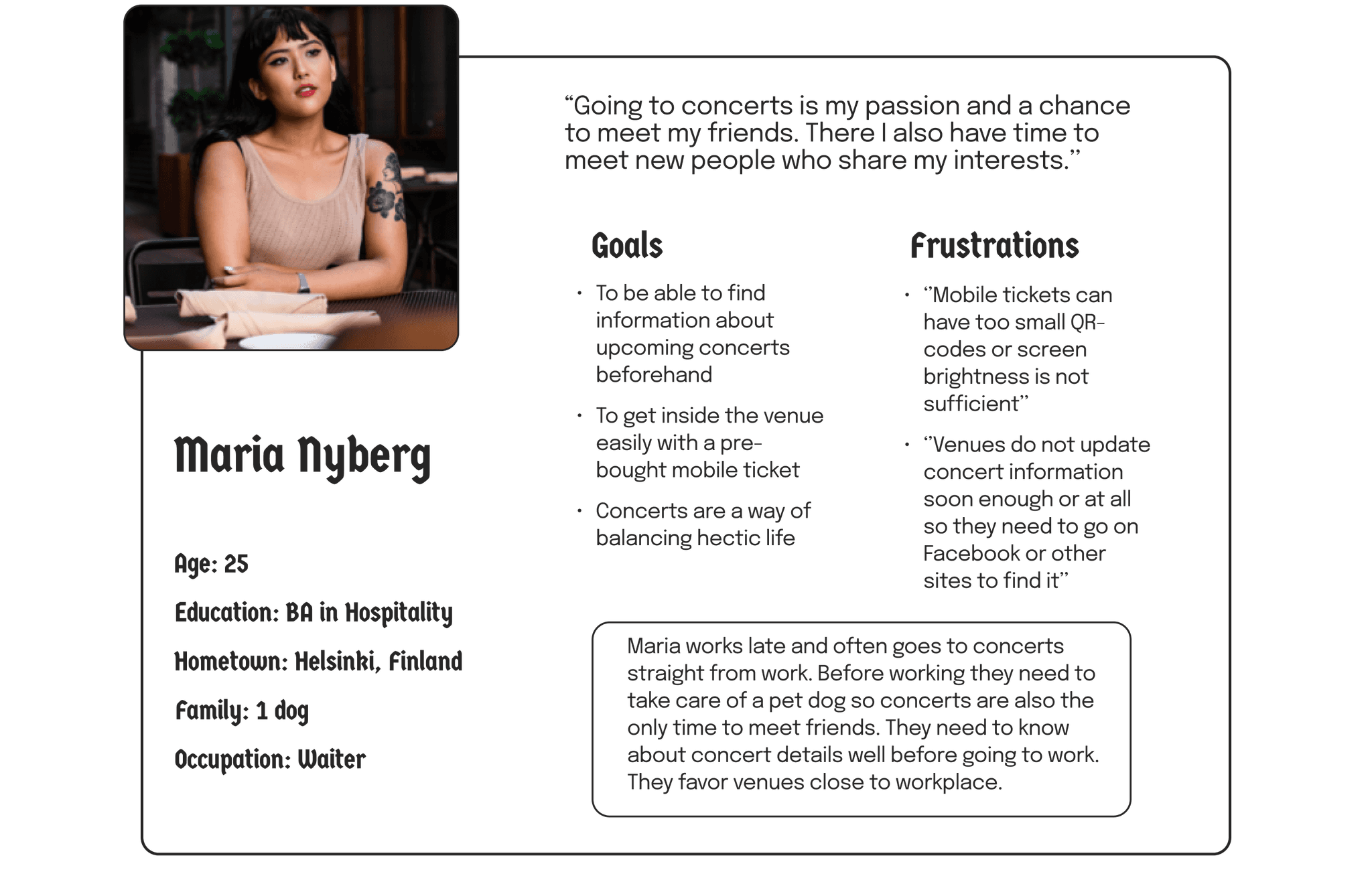
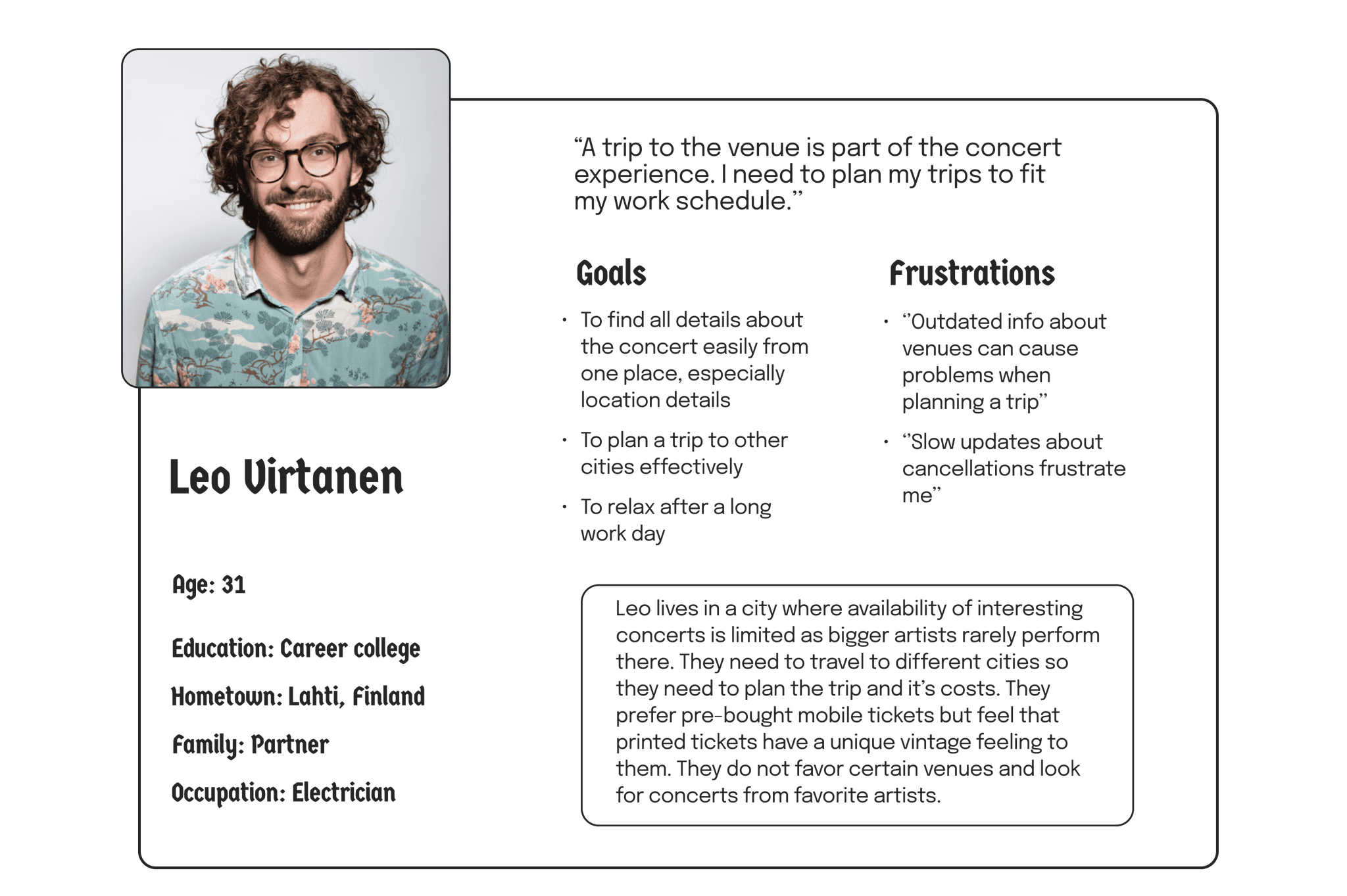
Two primary user groups were identified by analyzing the empathy map. The first group were users who often go to certain music venues close to them and prefer mobile tickets. Second user group consists of users who live further away from venues and only have the time to go and see their favorite artists. They go where their favorite artists perform and also see value in printed tickets while still favoring mobile tickets.
Personas created aim to present these user groups in an equitable way. During the project several accessibility considerations were also taken into account. These include proper color contrast and an option to purchase an assisted ticket.
User pain points
Four main user pain points were identified after analyzing the survey results using an affinity map:
Mobile tickets can have too small QR-codes and screen brightness might not be sufficient if the ticket is read by using another device.
Information about concerts can be divided on different sites which also makes it harder to know about cancellations. For example, in Finland a lot of the information can be found on Facebook and not in the venues' own sites.
For a lot of participants it is important to get needed information soon in order to plan their concert experience beforehand.
Many participants do not favor certain venues but go where their favorite artists are performing. This can be seen in countries with longer distances and fewer opportunities to see favorite artists. Location information needs to be accurate and easy to find.
User personas
Two user personas were prepared that present different user groups:
Wireframes
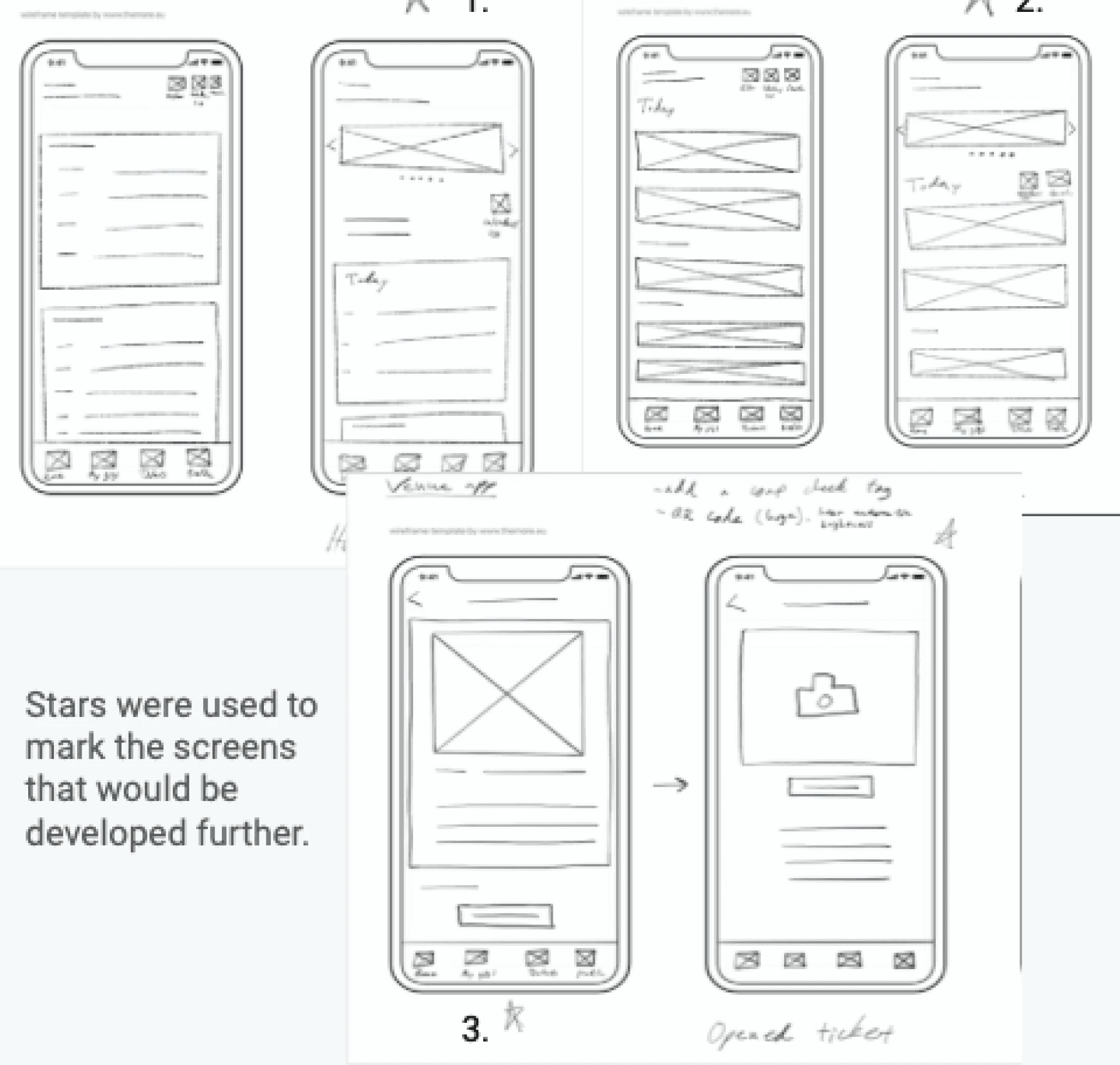
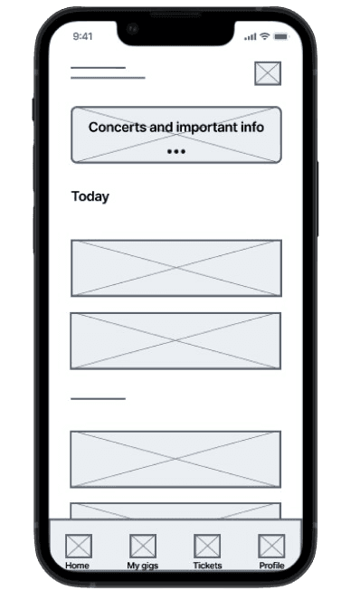
Both paper and digital wireframes were prepared. Iterating different screens ensured that the digital wireframes would address user pain points that were identified during research. Before this stage the flowcharts and user journey maps came in handy in order to understand what features should be included in the prototype and the wireframe.
Prototypes
After preparing digital wireframes a low-fidelity prototype was created. The prototype was then used for the first round of moderated usability studies. A representative of the user group was kind enough to partake in both of my studies. The first study revealed that buttons and icons needed to be bigger and placed more naturally, that users should be reminded of saved concerts and that the overall user experience is good but it still leaves some users out.
After making changes to the prototype, mockups and a high-fidelity prototype were designed. Using the high-fidelity prototype I organized a second round of usability studies. This time the results showed that the radio-button in the payment flow should indicate selected option more clearly, the language in the copy should be corrected and further accessibility adjustments should be made.
Takeaways
Takeaways
Testing during the project showed that the Soundwall app makes users feel like their needs are met. It also shows new ways for music venues to make visitors more engaged in the overall concert experience.
While designing the Soundwall app I really learned how you can't create a perfect product right away. Iteration is always needed. In addition, this process made me understand the fundamentals of the app design process. Next steps would be conduct testing with actual venue employees and design the rest of the screens that the current prototype does not include. Additionally, further updates on accessibility should be made.
All in all, it was fun to come up with new features that haven’t been used in existing products such as the possibility to collect virtual concert tickets or including a possibility to backup your coat tag. I still feel that there is a need for an app like this especially if it combined different concerts from different venues in Finland into one easily accessible platform.
Thank you so much for taking time to review my work. Feel free to contact me if you have any further questions or a new project in mind!