DNB Finland ry had a need for a new article page on their website showing new posts from different categories. I designed two different versions based on their current CMS layout.
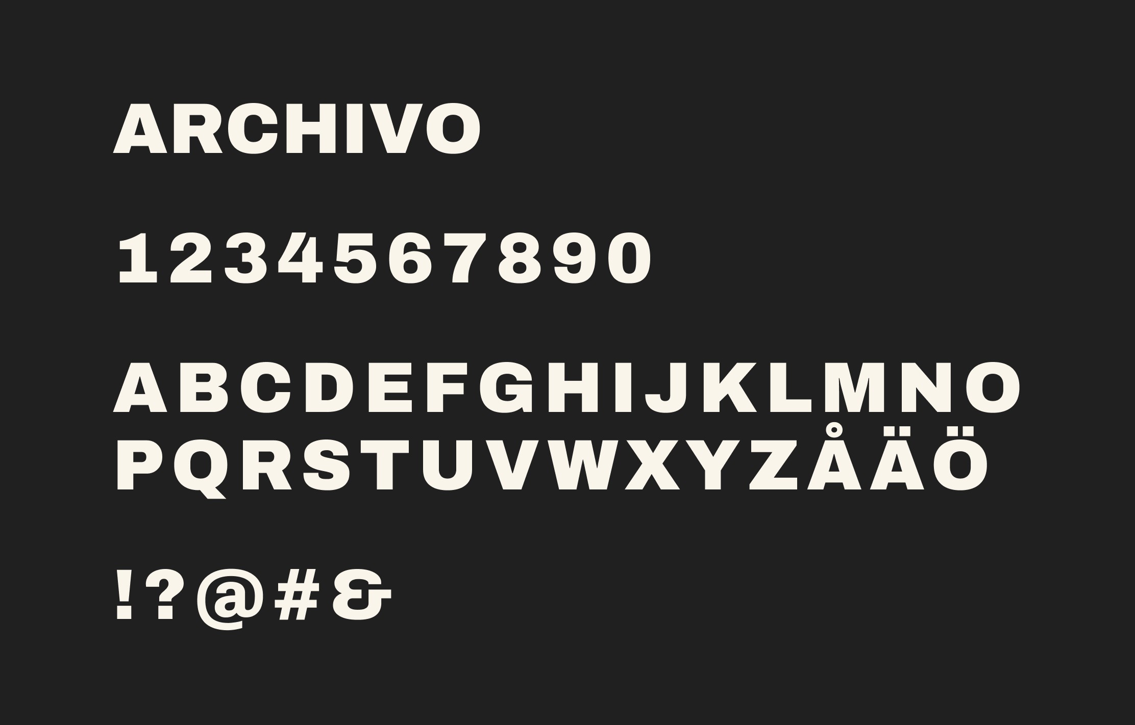
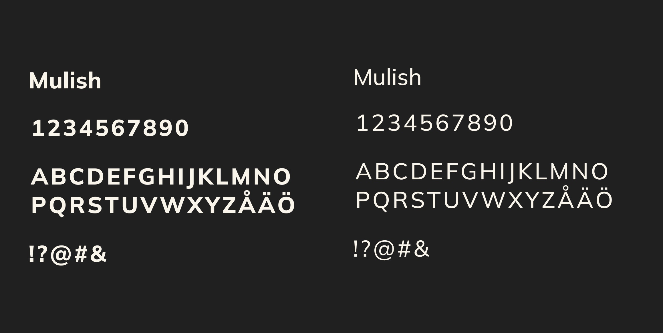
Additionally, they had a need for updated typography as their brand required more consistency. All of this was part of a bigger project aiming to design a brand book for DNB Finland ry.
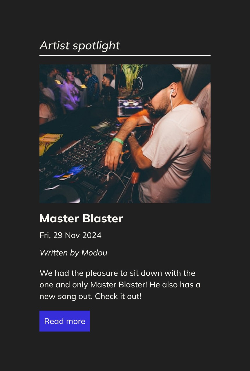
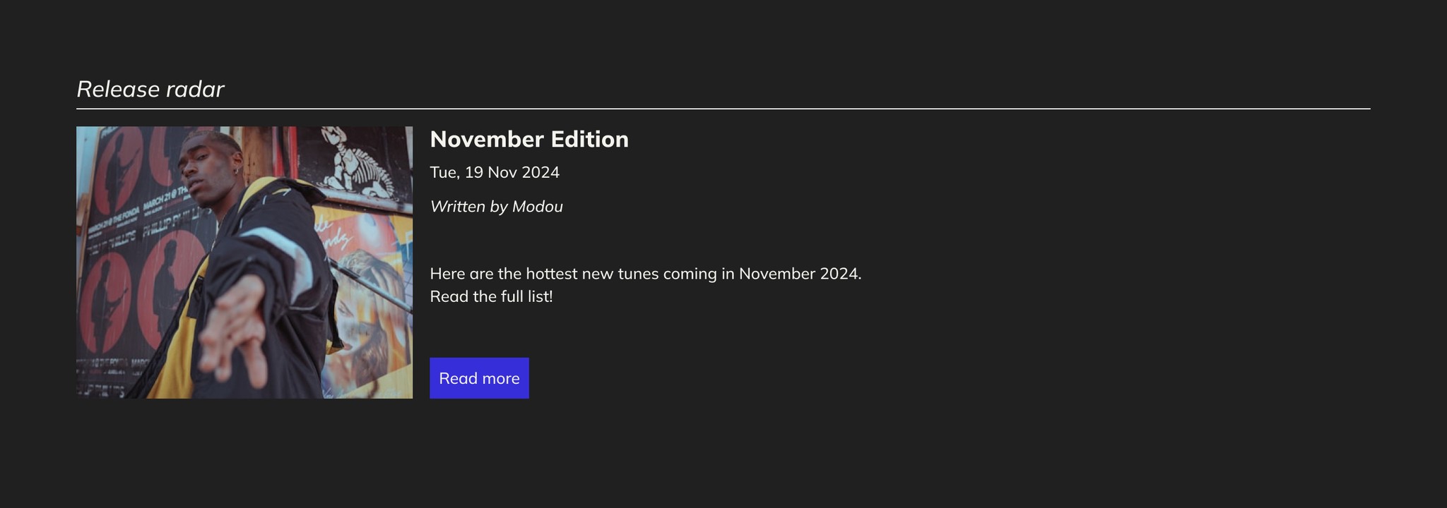
Here is a look at the final designs for the articles subpage. The design aims to solve the challenges listed in the next section below. Jakob Nielsen's usability heuristics have been implemented on the designs as well as the Gestalt Principles.
The components solve several needs while the navigation indicates the active page and a footer was designed for the whole website. The hero element has been kept in its original design and only the typography has been updated. These designs help the client in developing a consistent and clear user experience for the subpage.